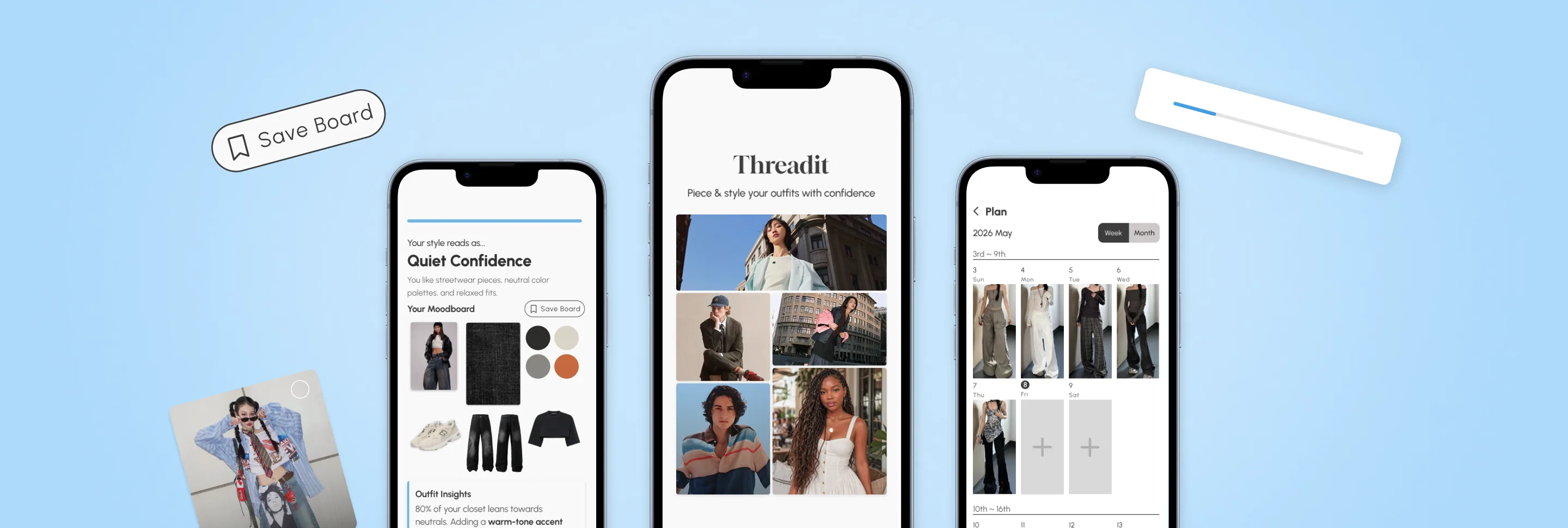
Mitigating First-Time User Activation Drop-offs in Onboarding
1st Place Winner (judged by LinkedIn & ServiceNow leads)
Timeline
March–June 2026
(8 Weeks)
My Role
Lead Designer
Team
4 Designers + 1 Design Lead
Skills
Figma, Design Systems, Prototyping, Hi-Fi Design, User Interviews
Overview
Everyday fashion enthusiasts curate endless style inspiration across apps, yet these images are forgotten in camera rolls due to a digital "pile-up."
When attempting to action these saves, users face intense psychological friction translating a look that fits onto their own body type, while professional styling remains financially inaccessible.
Design Interactive challenged our team of 5 to democratize personal styling, but the initial First-Time User Experience (FTUX) suffered from severe funnel drop-offs during high-latency closet importation tasks.
My Impact
I mitigated first-time user experience (FTUX) drop-offs in onboarding
My contributions included:
Owned the onboarding activation funnel to optimize completion rates without compromising critical data collection.
Designed a non-linear paced progress bar and continuous feedback loops to optimize perceived performance.
Introduced system safeguards (cancel/pause options) and motivational microcopy to alleviate trust erosion.
After 5 rounds of usability testing for onboarding, I accelerated time-to-value from 10 minutes to under 2 minutes. This eliminated the blank-slate "cold start" screen by turning a user's initial answers into instant, personalized style archetypes and visual mood-boards.
The Problem
Initial onboarding experience required users to upload their digital closets for tailored personal recommendations
This created a high-friction bottleneck: requiring users to invest significant time upfront before experiencing core product value, which caused early drop-off in the onboarding funnel.
Rich user data was needed to drive accurate styling, but asking for it upfront made onboarding feel tedious and high-effort.
The Design Challenge
How might we deliver immediate, personalized styling value before a user even finishes importing their closet?
Design Exploration
Designing for perceived performance and immediate activation
My first goal was to effectively optimize the FTUX to drive user retention. I initially considered a numbered progress indicator, which is a standard onboarding pattern as it gives a clear sense of structure.
Through conducting research, I later rejected the initial idea in order to satisfy Jakob Nielsen's Usability Heuristics
Visibility of System Status
The design should always keep users informed about what is going on, through appropriate feedback within reasonable time.
✕ Numbered Step Bar
✓ Non-Linear Progress Bar

Emphasizes amount of effort needed rather than progress made.
Communicates progress and motion without prompting users to count remaining steps.
Creates the wrong psychological signal for a FTUX design to reduce perceived friction.
Advances faster to create momentum so onboarding feels lighter.
Personalized styling requires perceived speed. Applying Nielsen's heuristic principle gives constant feedback as users advance every moment of the onboarding flow.
The Impact: I re-architected the onboarding flow to optimize perceived performance, implementing a non-linear progress bar and continuous feedback loops that successfully accelerated first-time user activation.
User Testing
Stripping psychological friction from the onboarding funnel
I conducted usability testing sessions with 5 users to observe where most high-latency drop-offs occurred across the current onboarding flow. I gathered 4 key feedback points:
114 Steps Is Too Long
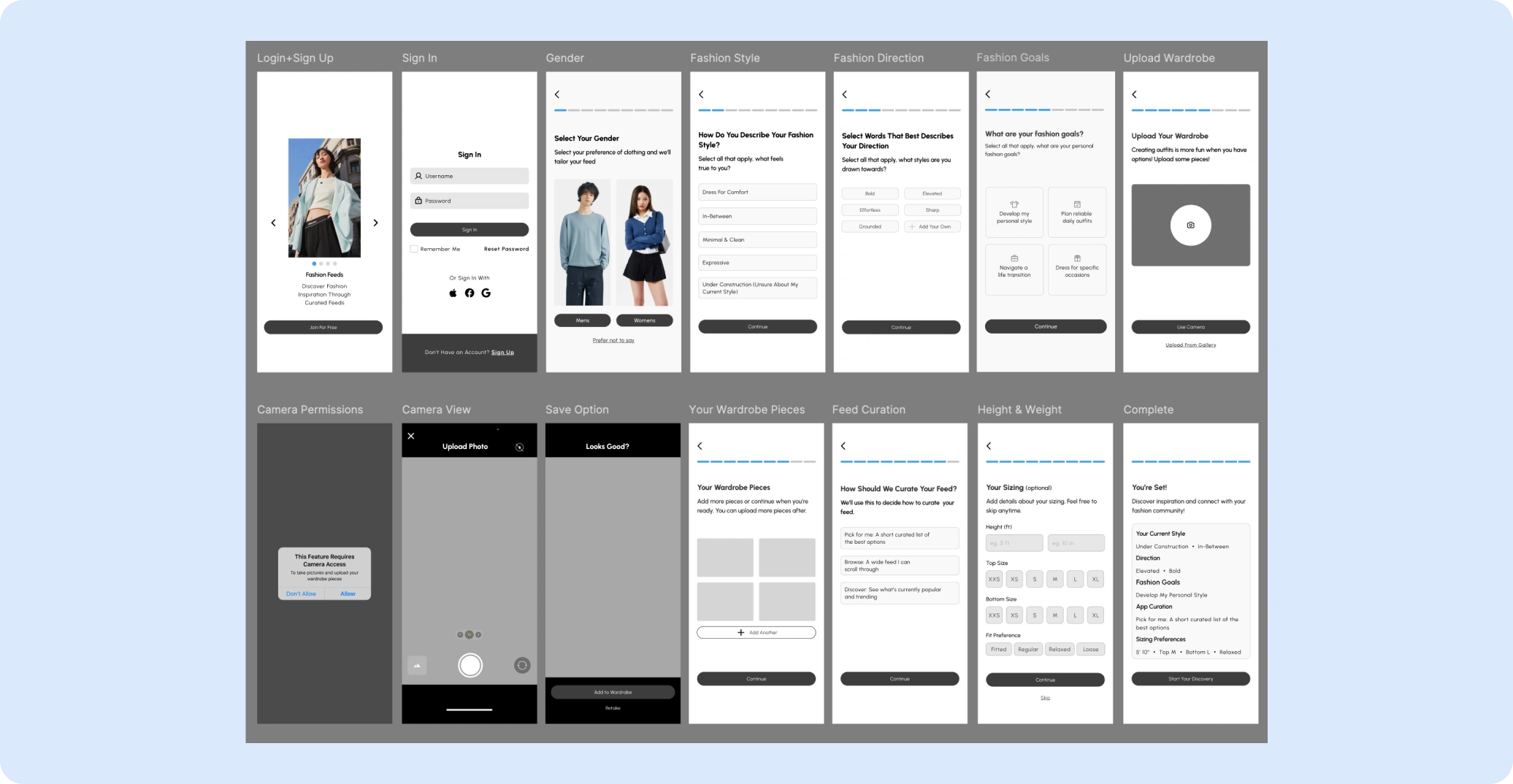
Users often lost the unique app value propositions since onboarding ran long.
2Camera Simulation Felt Long
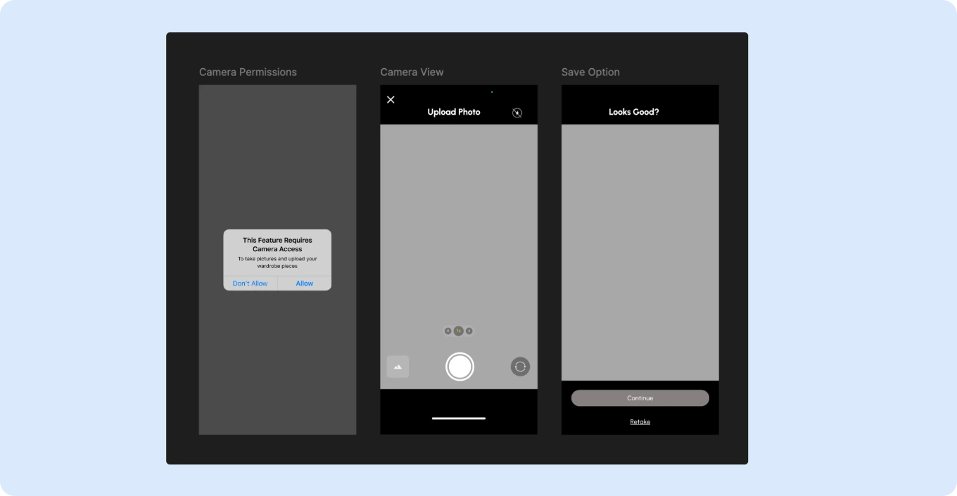
Simulated upload read as high-latency and often killed early retention.
3Feed Curation Felt Too Similar
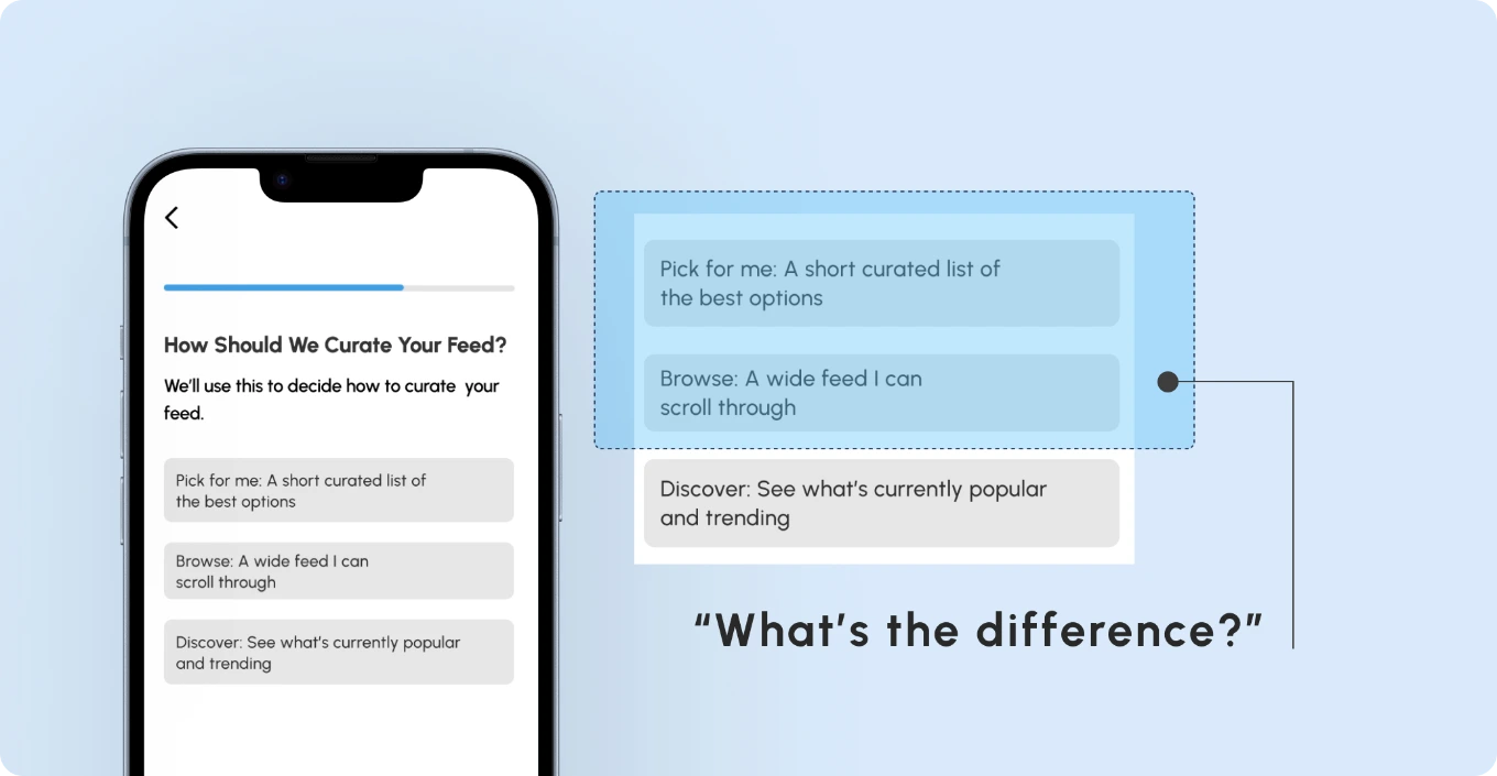
Browse + Discovery read as the same, leading to difficulty visualizing the feed.
4Inclusivity Concerns
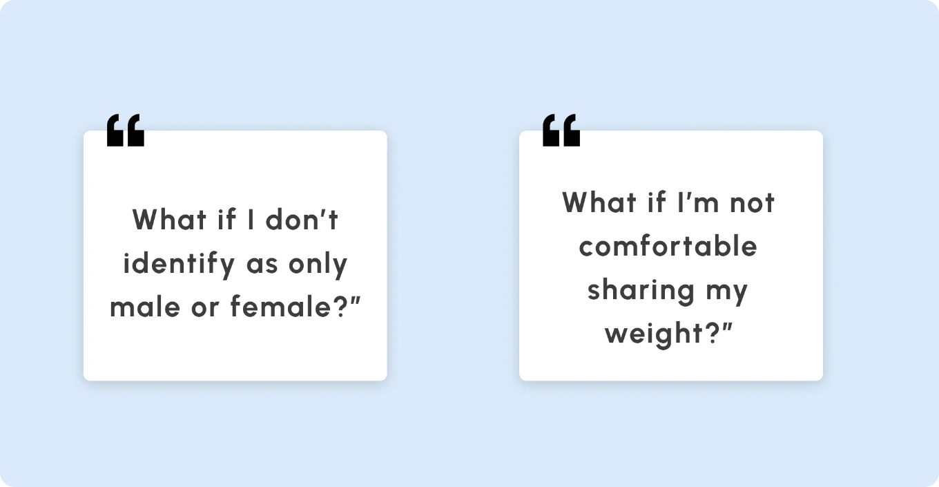
The weight + gender prompt became a sensitive identity and ethical concern.
After synthesizing testing findings, my next goal was to insulate the experience against high-latency drop-offs (such as physical closet importing). Based on testing findings, I revised the onboarding flow
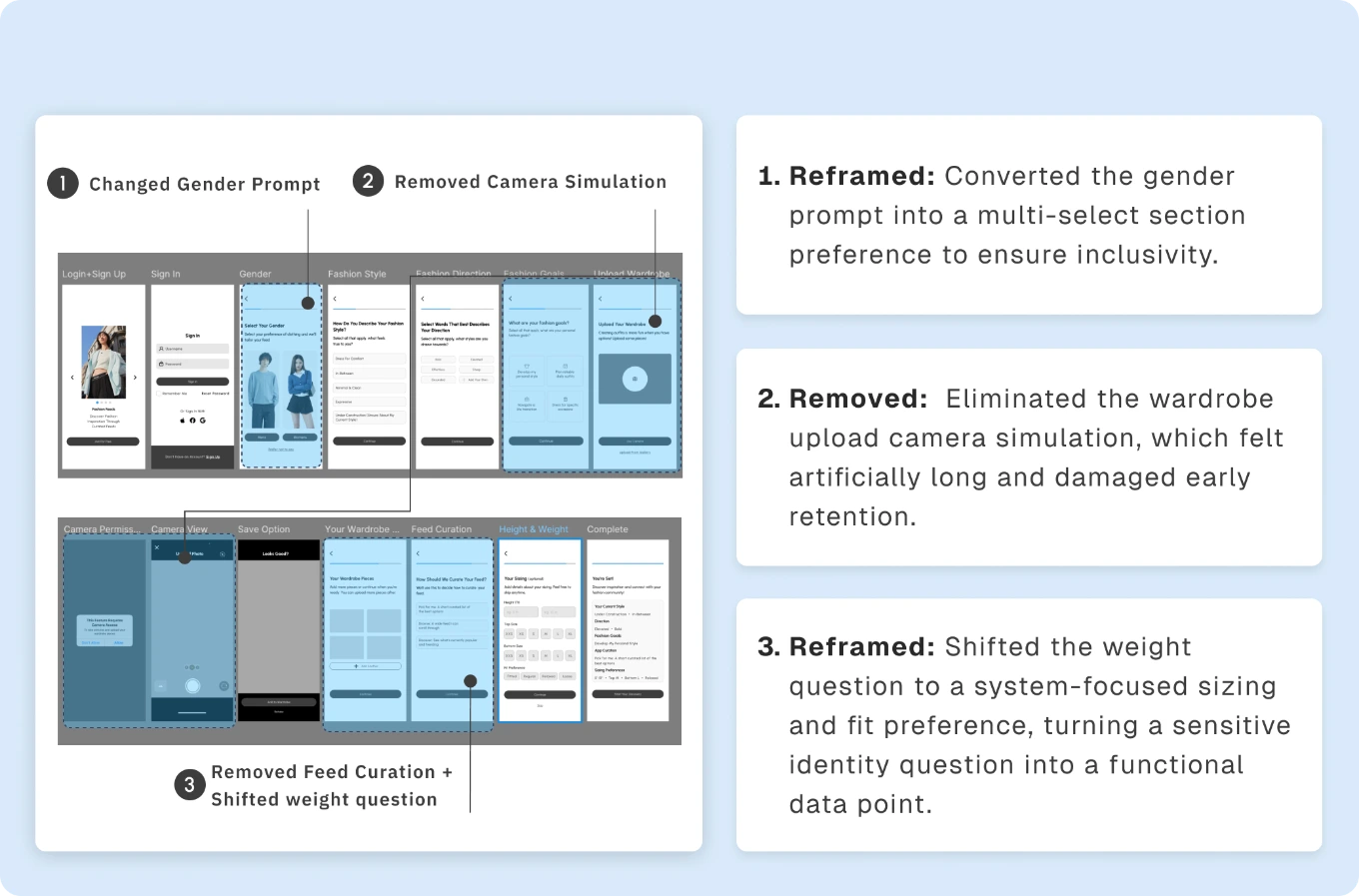
Before Finalizing
Accelerating time-to-value without cognitive overload
Before finalizing the solution and to streamline the core interaction model, I introduced clear cognitive scaffolding alongside proactive error-prevention guardrails.
This ensured user inputs mapped effortlessly to tailored style archetypes without inducing decision fatigue.
1Photo Lighting Tips
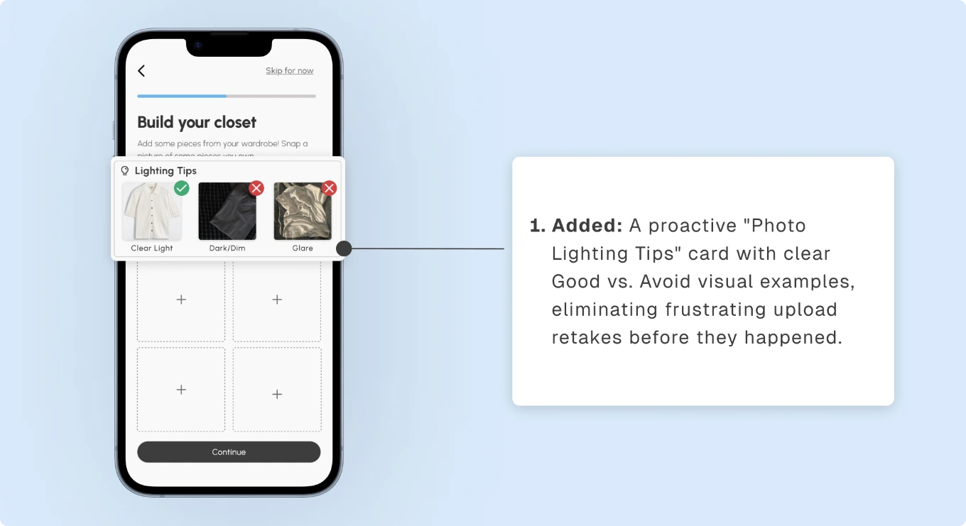
2Contextual Info Icons
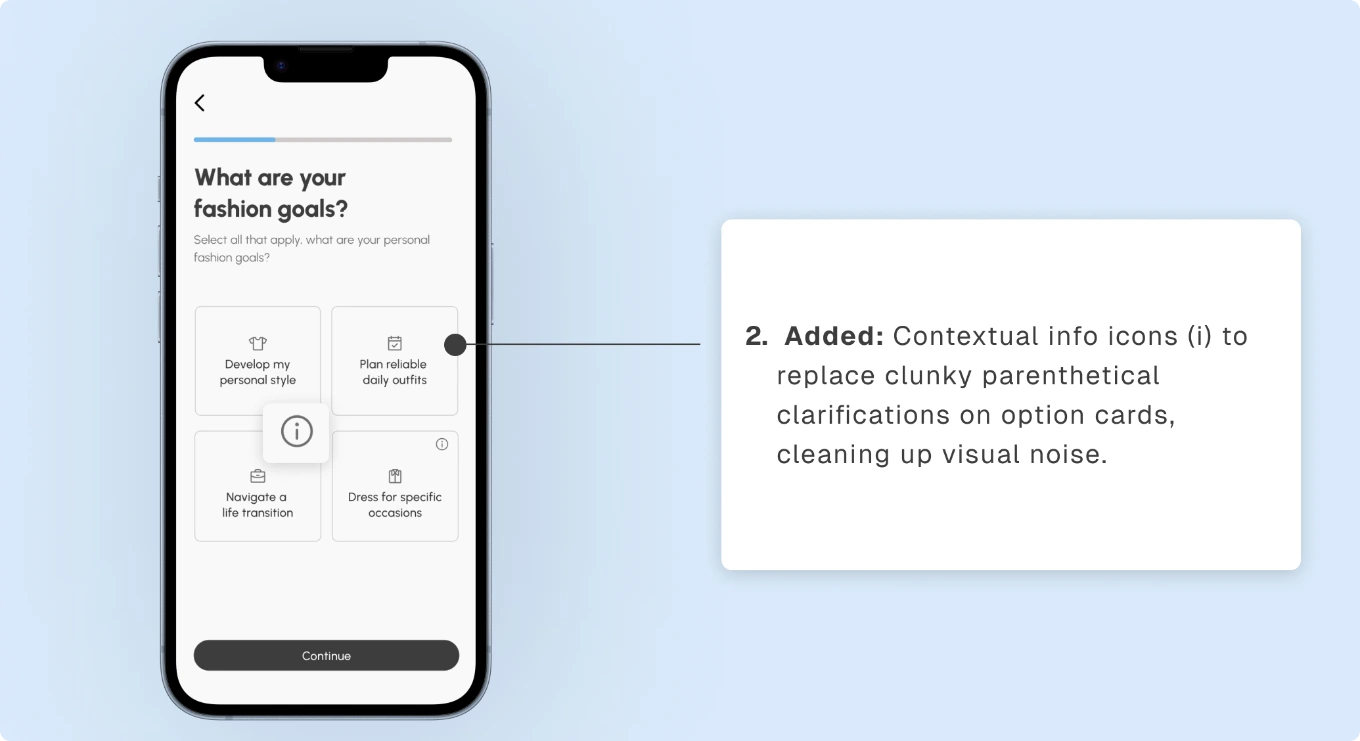
3Style Archetype + Moodboard
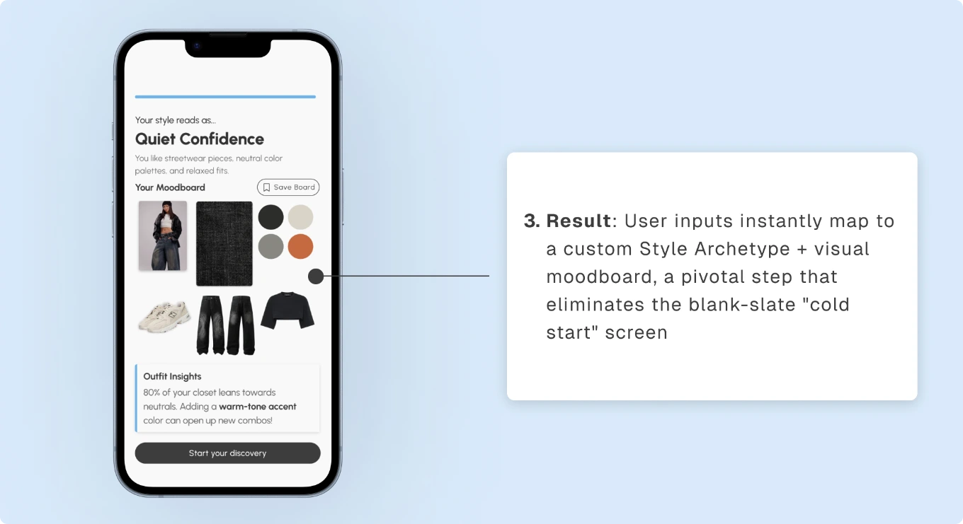
Finalized Solution & Impact
After I re-architected the onboarding flow, I reduced time-to-value from 10 minutes to under 2 minutes
Onboarding was cut from 14 to 8 screens, reducing time-to-value from session-end to the first session, achievable in under 2 minutes. I further reduced retention drop-offs to deliver an effective First-Time-User Experience.
Reflection & Takeaways
I learned that product thinking means designing for behavior, not just screens
Product thinking pushed me to evaluate success through what users actually do, not simply how a feature looks or functions. Through usability testing with first-time users, I learned that onboarding decisions are best validated by observing whether users understand the product, make confident choices, and reach value without friction.
This changed how I approach design: before designing a screen, I now ask, “What should the user understand, decide, or do differently because of this experience?”
If I had more time to explore further…
I would take the product beyond the core experience by exploring sustainable business models, personalization, and ecosystem integrations. I'd test freemium versus affiliate models, expand the archetype library based on user demand, and explore integrations with platforms like Pinterest to enable one-tap inspiration imports.
The Outcome!
Our team won 1st place in Design Interactive cohort (judged by LinkedIn and ServiceNow leads)
During cohort presentation night, my team presented a slide deck of our prototype. The judges commended our use of storytelling and, as a result, we won first place!
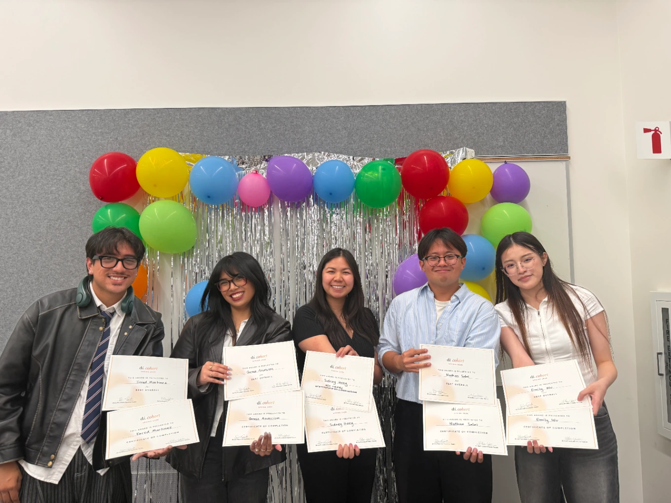
Gratitude & Special Thanks
Thank you to my wonderful design team and mentors!
A special shout-out to my design members: Jared Martinez, Grace Asuncion & Emily Wu! A bigger shout-out to my design lead, Sidney Heng, and my team's industry mentor Juliana Viado (Product Designer, Leela), for providing guidance throughout the cohort! It was super rewarding to have worked alongside my members, who each provided valuable perspectives that I carry forward into my future work.
Special shout-outs to Chris Ota (Staff Product Designer, LinkedIn), Ken Skistimas (Director of UX, ServiceNow), Aditi Jain (UI Designer, Computrition) and my team's industry mentor Juliana Viado (Product Designer, Leela) for providing valuable feedback during presentation night!