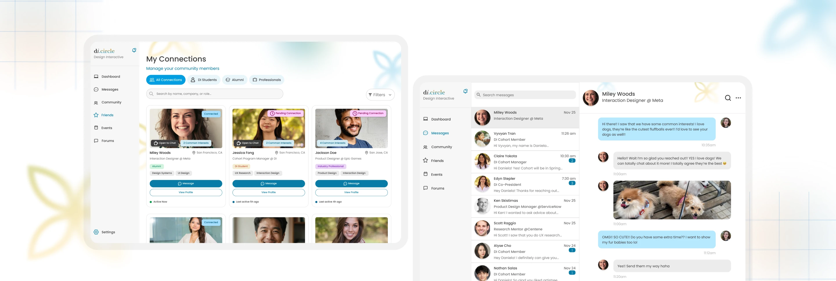
Lowering the psychological barrier to starting professional relationships
Redesigning student-to-professional outreach through insights from 8 usability tests
Timeline
Oct – Dec 2025
(8 Weeks)
My Role
Lead Designer
Team
3 Designers + 1 Design Lead
Skills
Figma, FigJam, Prototyping, User Interviews
Overview
Students have access to a network of industry professionals, but students face difficulties in outreach
When students attempt to start a conversation and maintain a relationship with a professional, they're met with intimidation and uncertainty. This results in potential connections often becoming a collection of unopened profiles and unsent messages.
Design Interactive challenged our team of 4 to design an accessible outreach experience for students connecting with a professional network.
My Contributions
I redesigned the connection journey to reduce friction in professional outreach
My contributions included:
Designed and owned connect requests, relationship management, and the messaging experience.
Applied behavioral psychology principles to redesign iterations, reducing user friction.
Refined community profiles to better support the transition from evaluating a potential connection to reaching out.
Across 8 rounds of usability testing, I identified and addressed high-risk friction points across a student's connection journey, from finding a professional to initiating and maintaining a relationship.
Final Artifacts
Designing an end-to-end experience to help students move from discovering a professional to building an ongoing relationship
Connecting with a professional
A connection flow designed to give students enough context and confidence before reaching out.
Relationship management
A management flow for filtering and maintaining professional relationships.
Messaging Experience
A conversation flow that gives students a lower-pressure starting point after connecting.
The Problem
Students lacked the confidence, context, and low-pressure opportunities needed to initiate the first conversation
They faced barriers such as intimidation around reaching out, uncertainty about how to start a conversation, and difficulty maintaining relationships.
This often results in friction between finding the right person and building a genuine connection.
Research Insights
The biggest friction occurred between finding someone and feeling ready to reach out
Before designing, I wanted to understand what exactly made professional outreach feel difficult and where students hesitated most throughout the connection process. Across 11 collected interviews with college students, the key insights were:
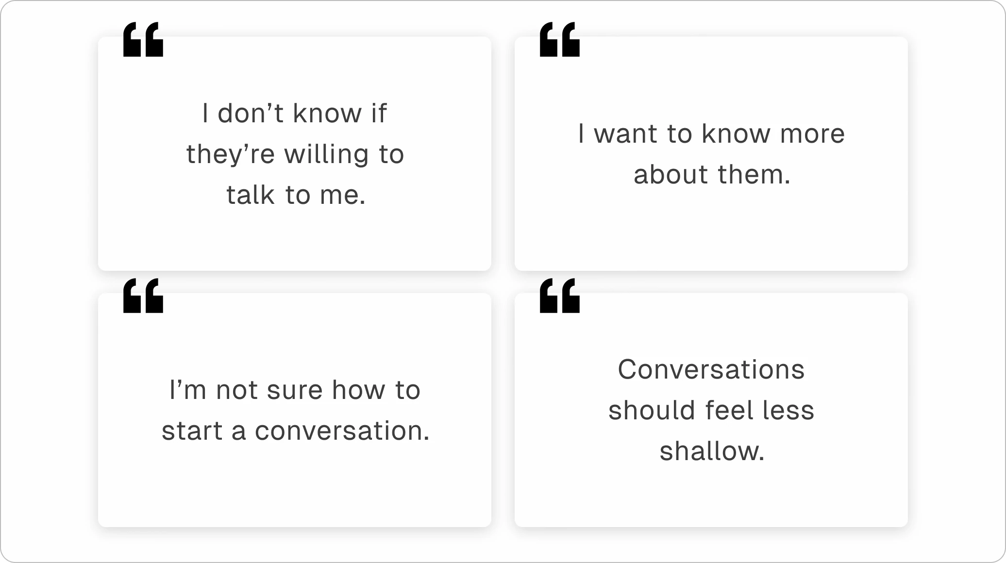
Research revealed that students could find professionals, but often lacked the confidence and context needed to decide whether and how to initiate contact.
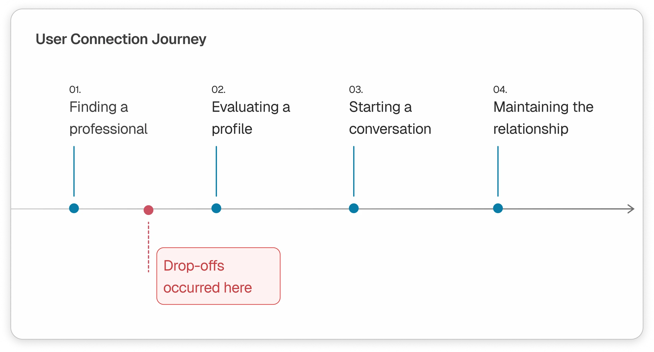
The highest-friction moments occurred around evaluating whether to reach out, initiating the connection, and knowing what to do afterward.
This reframed the design problem from helping students find professionals to helping them feel confident enough to build a relationship.
Design Challenge
How might we make professional relationships easier to start and maintain?
Key Design Moments
Across 8 usability tests, I identified four moments where students needed more confidence, context, or support to move forward
I refined these interactions based on what users struggled with — not by redesigning every screen, but by focusing on the moments that most affected the connection journey.
Testing revealed that users wanted to understand a professional before deciding whether to reach out
I explored how much information was enough to make that decision without overwhelming them, through community profile cards.
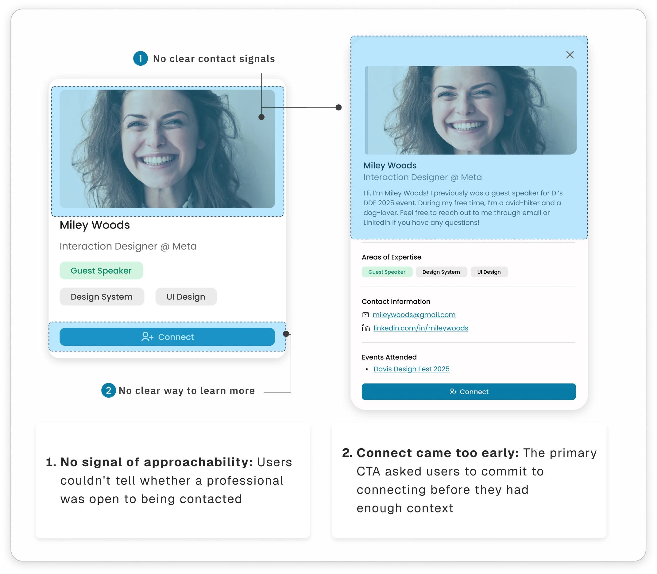
Rather than asking users to commit immediately, I introduced a lower-pressure evaluation step that lets them understand the person before deciding to reach out.
Making the first connection feel intentional, clear, and low-pressure
Even after deciding to connect, users noted that they needed more control over how they initiated the relationship. While they knew more about the person, there was still hesitation in initiating the connection.
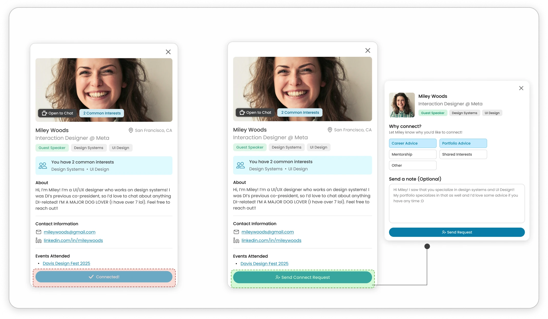
Users hesitated when asked to commit before they had enough context.
Users can communicate why they're reaching out with clear intent
Keeps personalization low-pressure with an optional note to add context
Users can decide how they want to connect before sending the request
I turned “Connect” into a more intentional interaction by giving users a way to communicate their reason for reaching out, while keeping personalization optional.
Making relationship states visible after connecting
Once a connection request is sent, users needed a clear way to understand their relationship state and decide what to do next. I explored ways for users to manage their relationships.
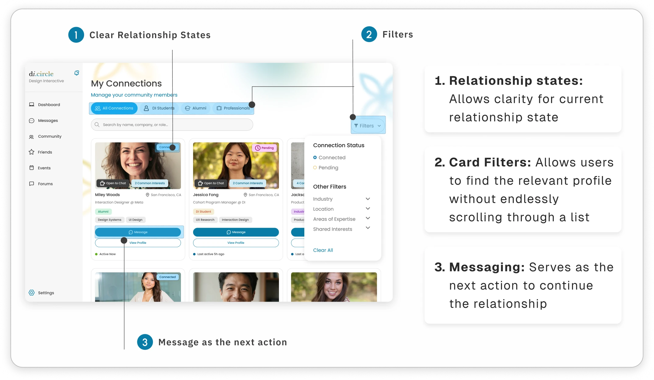
I shifted the experience from simply storing connections to helping users understand and act on their relationships.
Help users start and maintain the conversation to build the relationship
The blank message field created another psychological barrier. After connecting with someone, users were still faced with an open-ended question: “What do I say?”
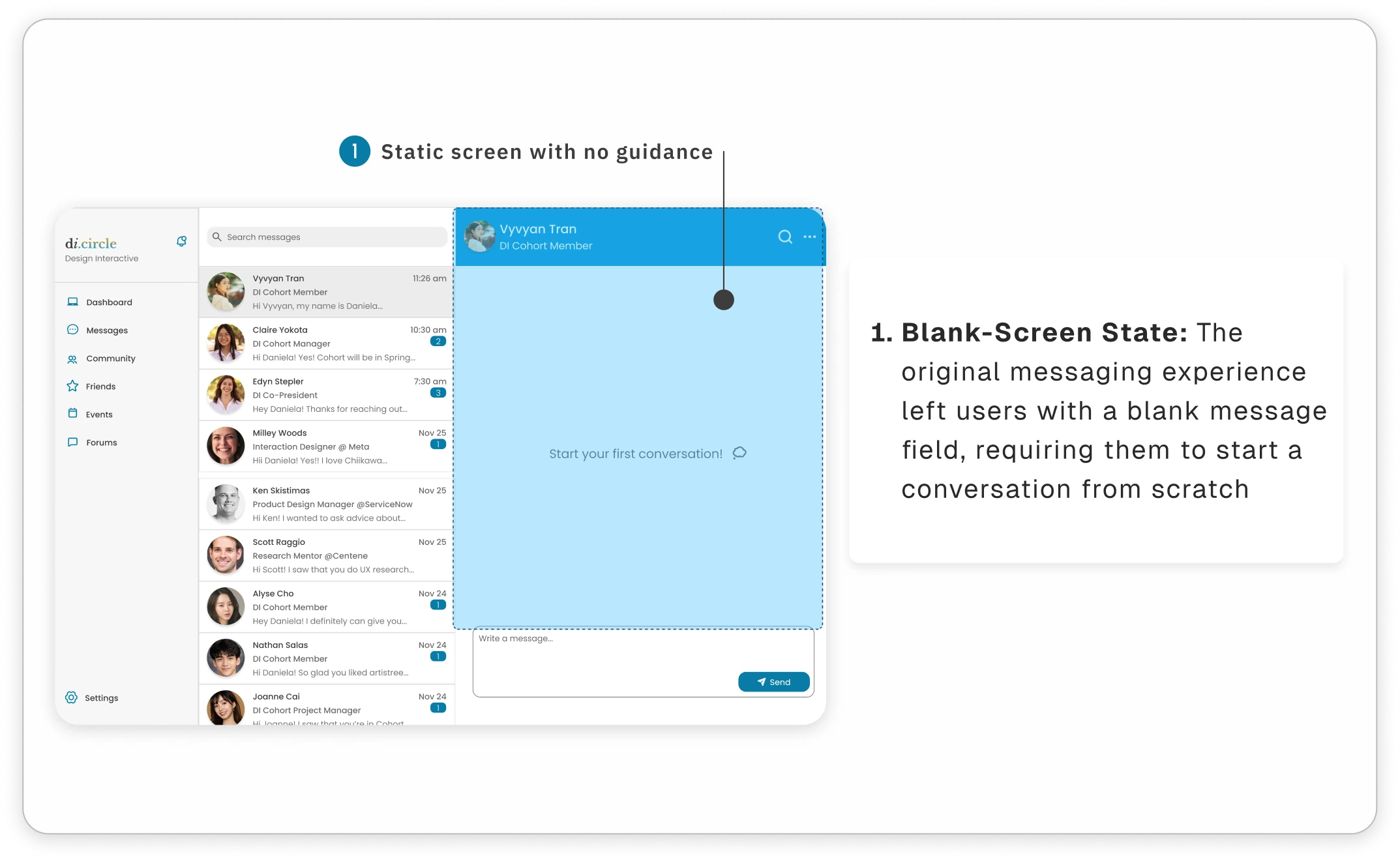
Rather than asking users to figure out what to say on their own, I introduced optional prompts that turn a blank conversation into an actionable starting point.
Impact
I turned a high-friction connection flow into a clearer path toward relationship-building
Across 8 rounds of usability testing, I identified and addressed friction across a student's connection journey, from finding a professional to initiating and maintaining a relationship.
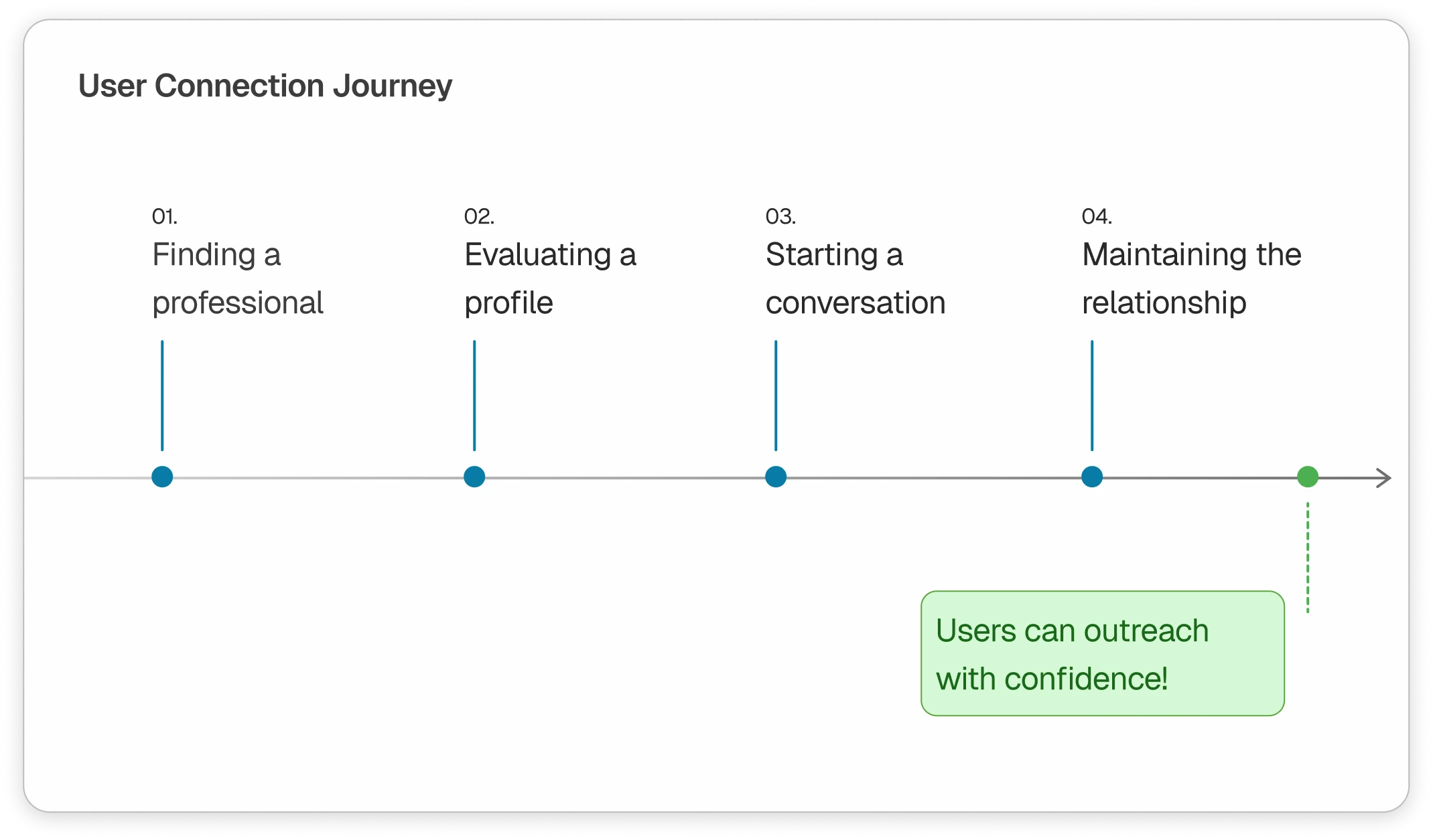
Rather than measuring success by the number of screens completed, I observed and measured success through users' behaviors throughout the experience, and whether it reduced the friction between wanting to connect and feeling confident enough to reach out.
Reflections
I learned to design for the behavior behind the interaction
Students have the accessibility to connect with professionals, but the hardest part was feeling confident enough to act on it. Through usability testing, I learned that reducing friction isn't always about simplifying an interface. Giving users the context, reassurance, and guidance they need to take the next step is just as important.
The Outcome!
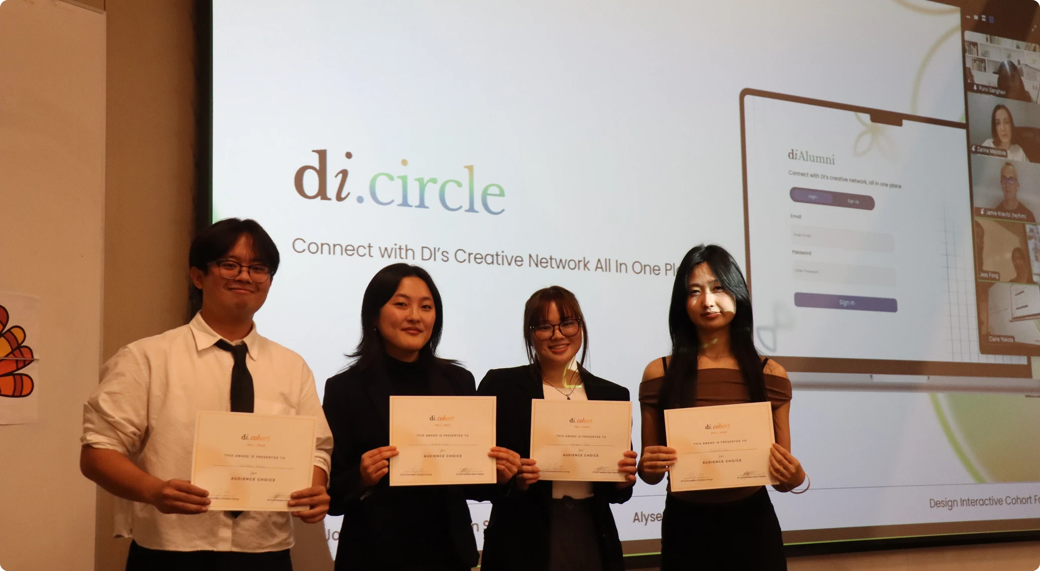
Our team won Audience Choice in Design Interactive's cohort!
During Design Interactive's cohort presentation night, we presented our solutions and prototype to our audience and won Audience Choice!
Gratitude & Special Thanks
Thank you to my wonderful design team!
A special shout-out to my design members: Alyse Cho & Vyvyan Tran! And a big thank you to our design lead Joanne Cai for mentoring our team throughout the design sprint! Each member worked endlessly together.